Foxford is the largest online school for students, teachers and parents in Russia with over 7,5 million users. In online courses and individual classes with a tutor students prepare for exams, olympiads, study school subjects.
Over the course of 2 years, I have been actively engaged in the landing page project, creating two global versions, conducting 10 experiments, and numerous user interviews. Additionally, I redesigned it to align with the company’s new brand.
The company set a goal to increase tutor’s courses profit. New landing was a part of this goal.
We have a lot of tutors courses and now each landing page is filled and maintained by each business segment separately. Sometimes the information on the landing duplicates that which is reflected in the default blocks. It clogs up the user’s path.
Foxford teaches children from 3 to 18 years old. They all have different goals and problems: to prepare for school, to pass exams, to learn English. But the tutor’s landing is the same for all the user’s segments, and only one block is customisable. The company adapted the other landings for different segments, and the conversion rate on the new landings went up.
Increase the conversion rate to buy packages by improving the communication for each segment
Optimize the management of tutors courses for business
Change the focus of the landing page from an introductory lesson to a purchase immediately
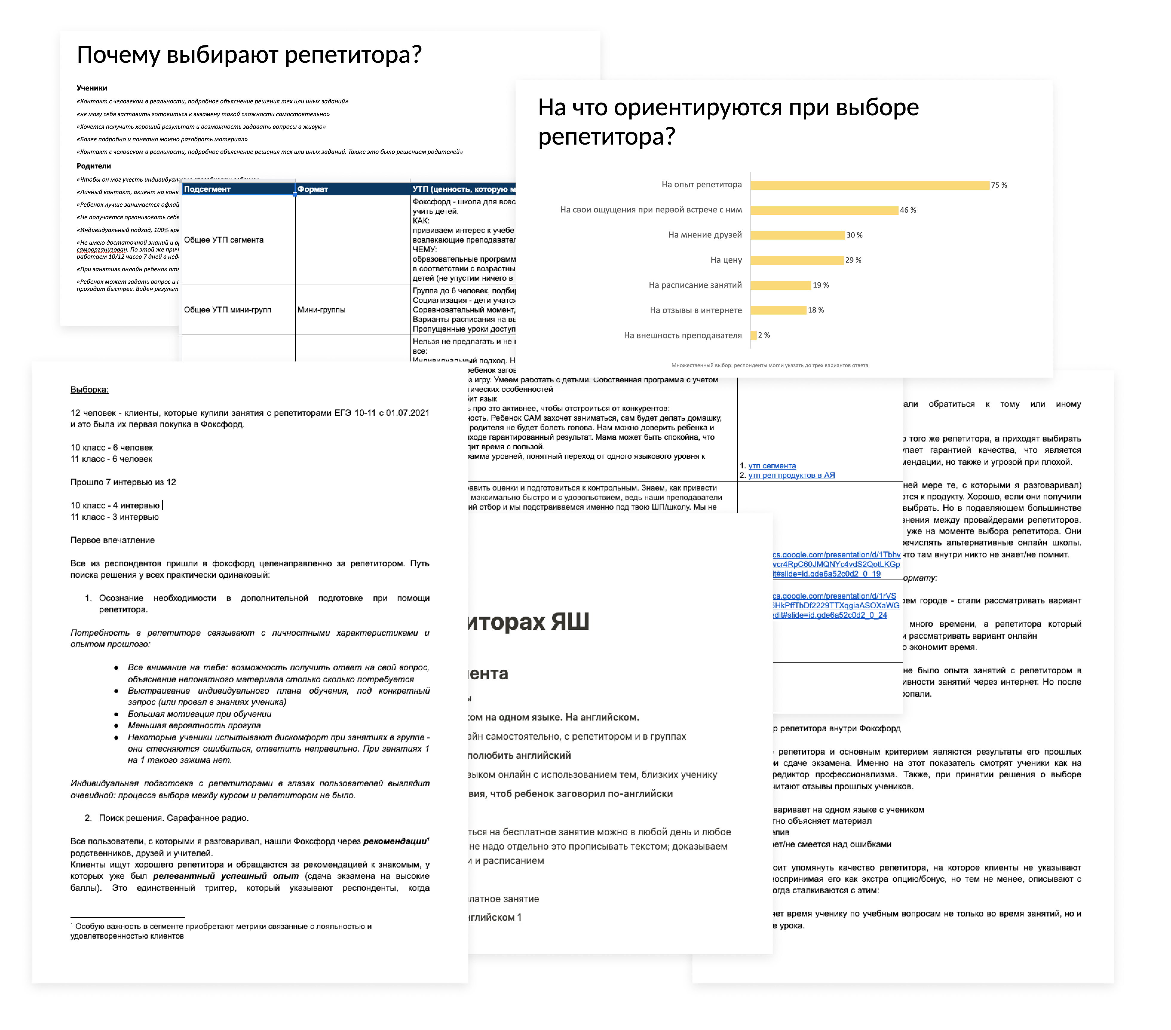
Me and the UX writer analyzed documents and research from the business: what is most important to our clients.
From the task card, you can click on the site number to go to the map and see itsWe explored a couple of options of landing’s structure:
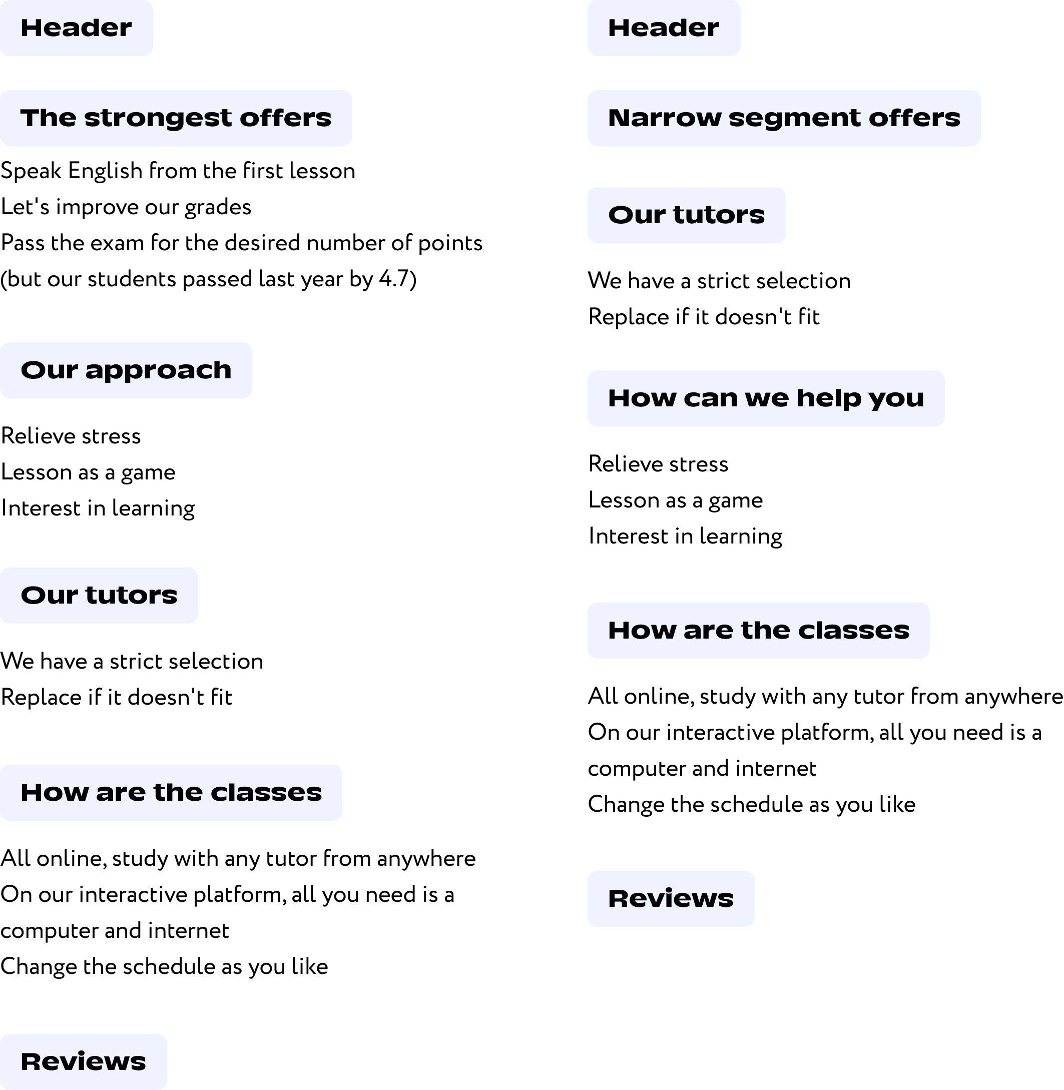
I decided to choose structure with first block with information about our tutors, because identity and experience of tutors the most important thing for our clients.
I got a list of all the company’s courses (more than 70!) and divided it into segments according to learning goals and the age of the students. After consulting with the business, we did the final list of segments.
Preschool
School program 1st-4th grade
School program 5-9 grade
School program 10-11th grade
Preparation for the USE
Preparation for USE
Preparation for university entrance exams
Preparation for Olympiads
English language
Other languages
International exams
The block with main universal trade offers on the old landing was the same for all segments. The business only change the text. Sometime this text duplicated information from other blocks. Sometimes there were grammatical and spelling mistakes.
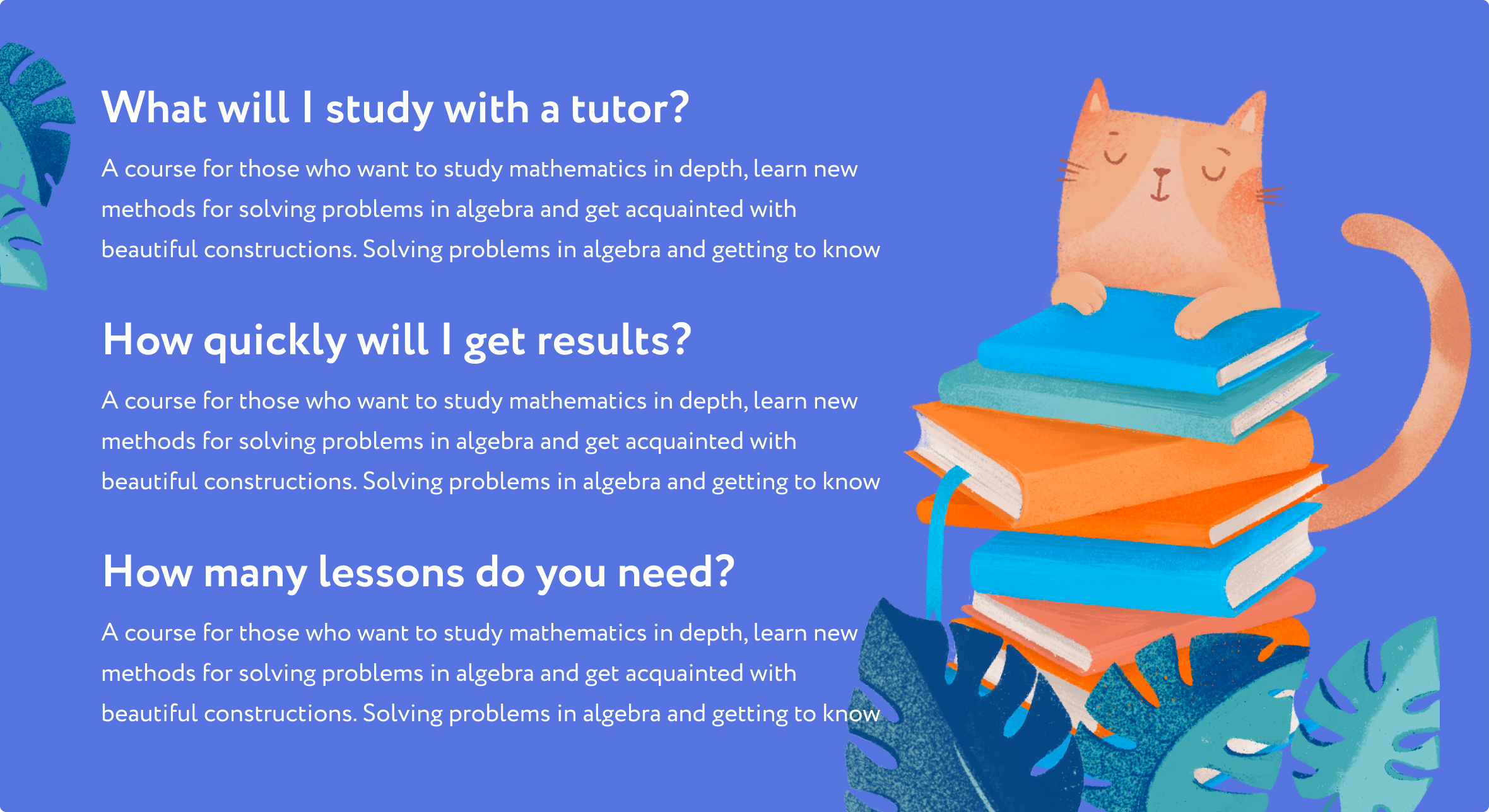
Based on the research, we made unique options for each segment. I designed a system of block for each segment. Business no longer need to write advertising themselves. The manager simply selects the desired segment in the admin panel without designing everything from scratch.
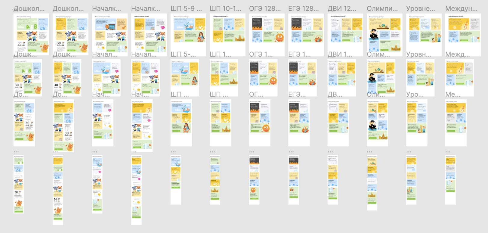
I explored a lot of layout options. I decided to put at the first and the last place the most important promotional offers. And add some matching illustrations to each block.
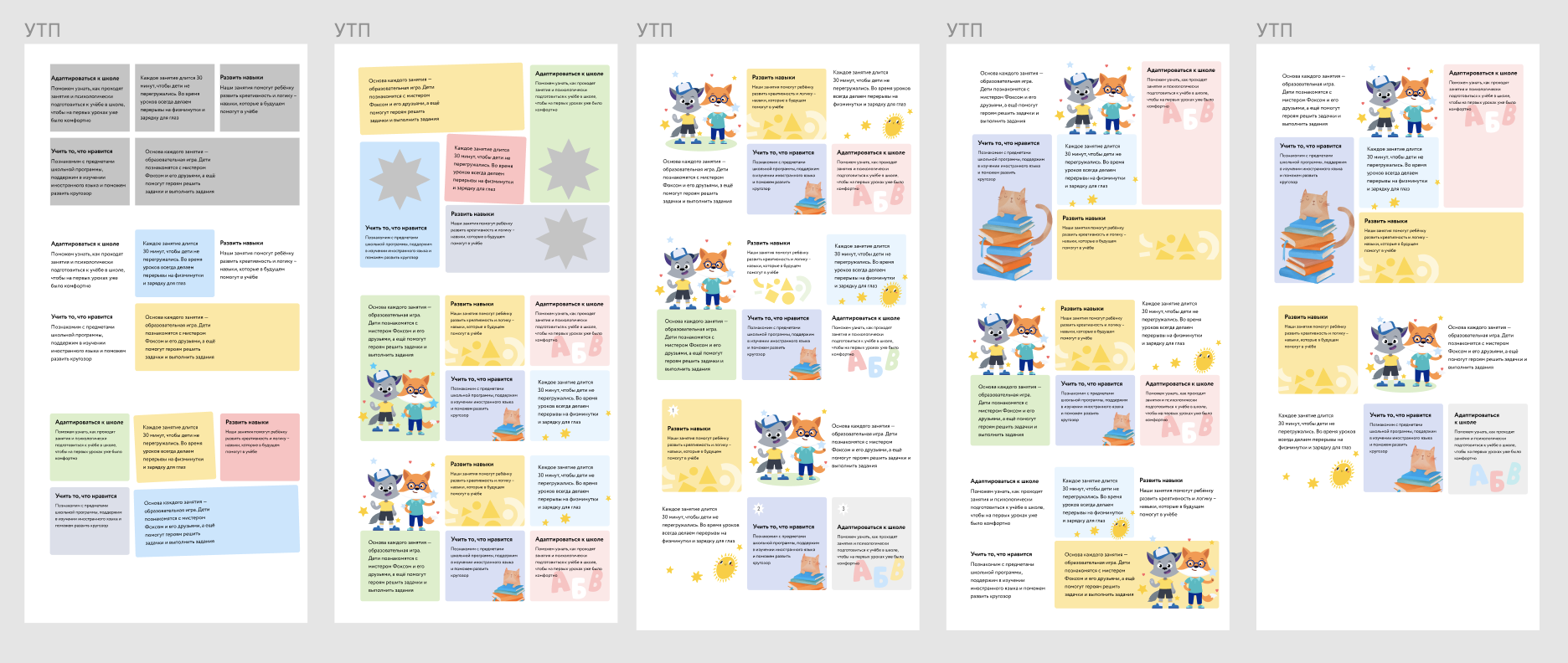
This is final result:
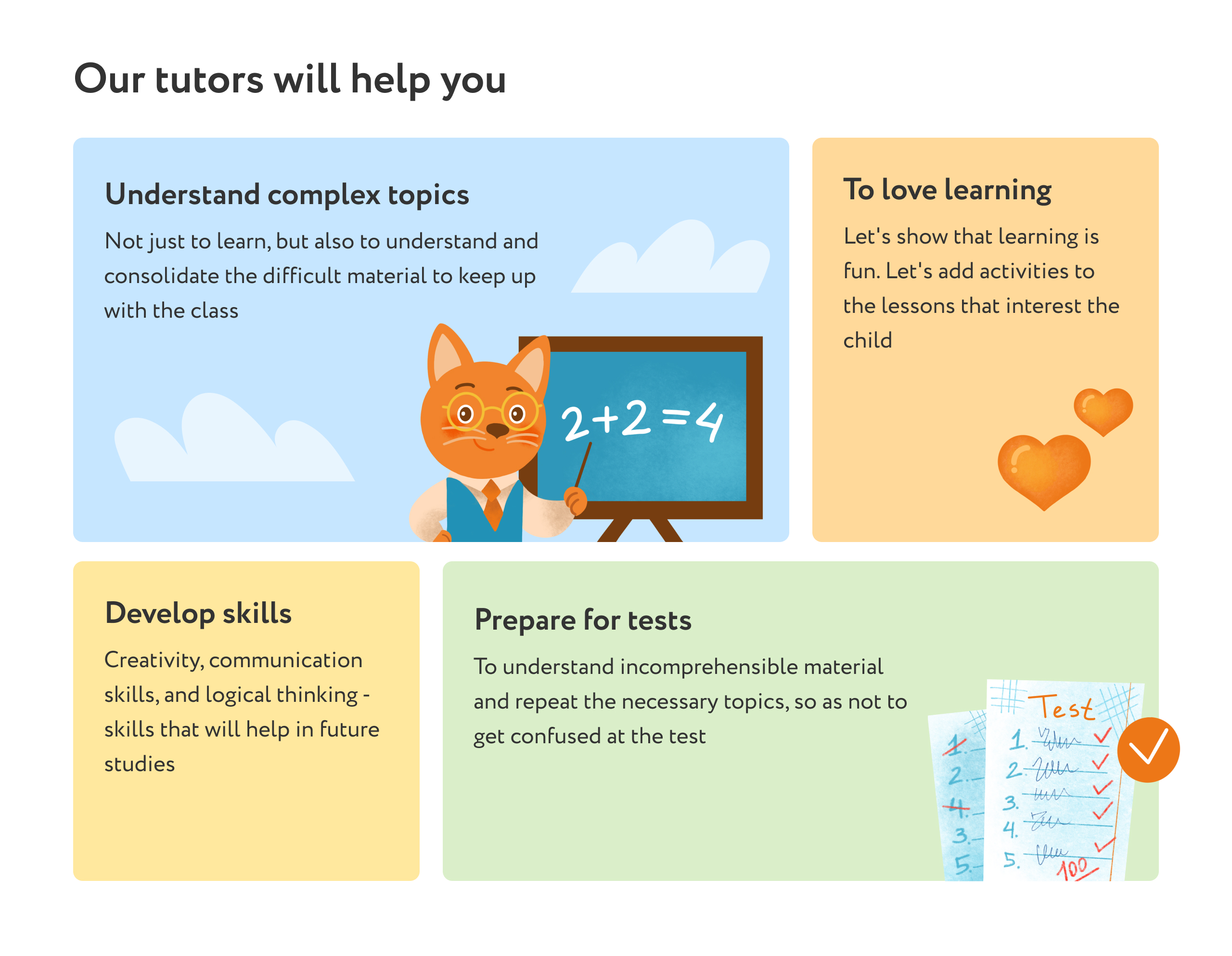
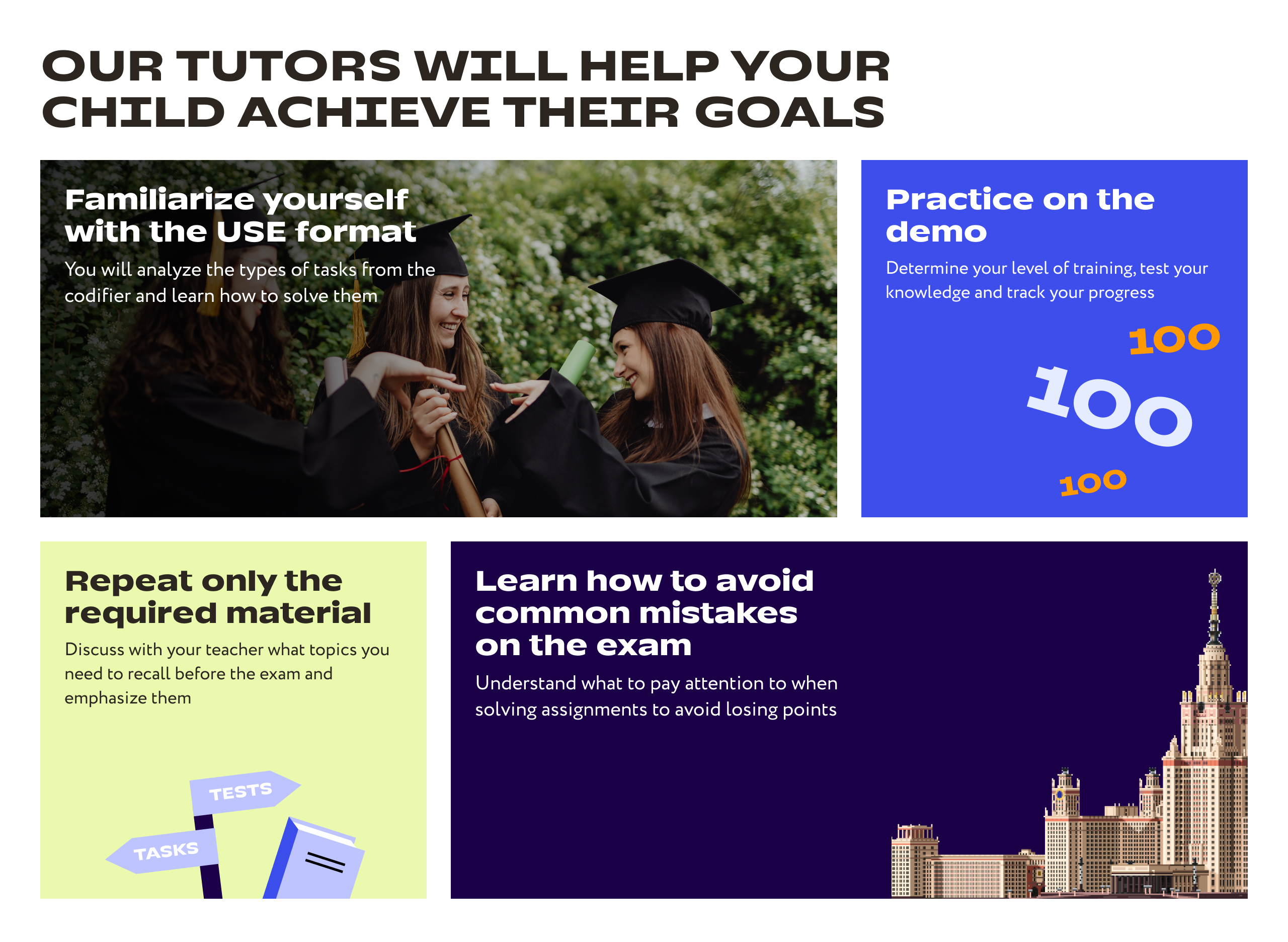
In mid-2022, the company underwent a rebranding. Each segment: elementary school, middle school, and high school, has its own style. So, while working on the redesign of the brand’s new landing page, I made the block different for each segment.
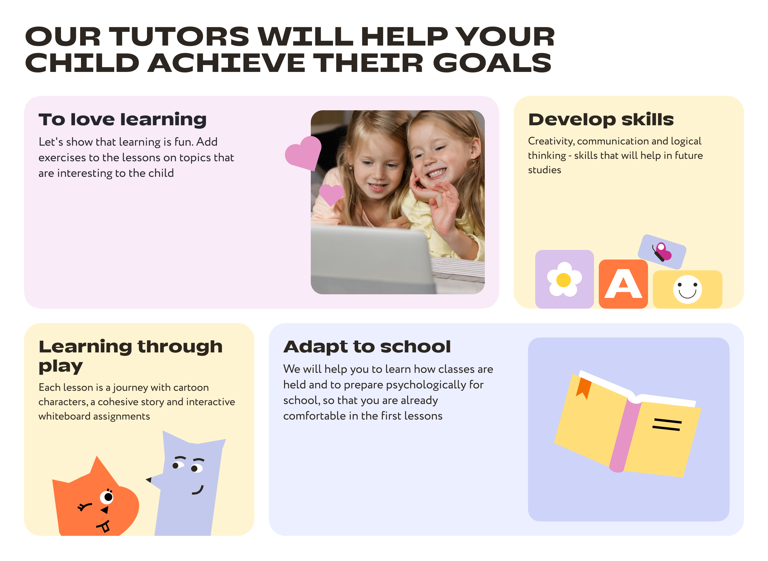
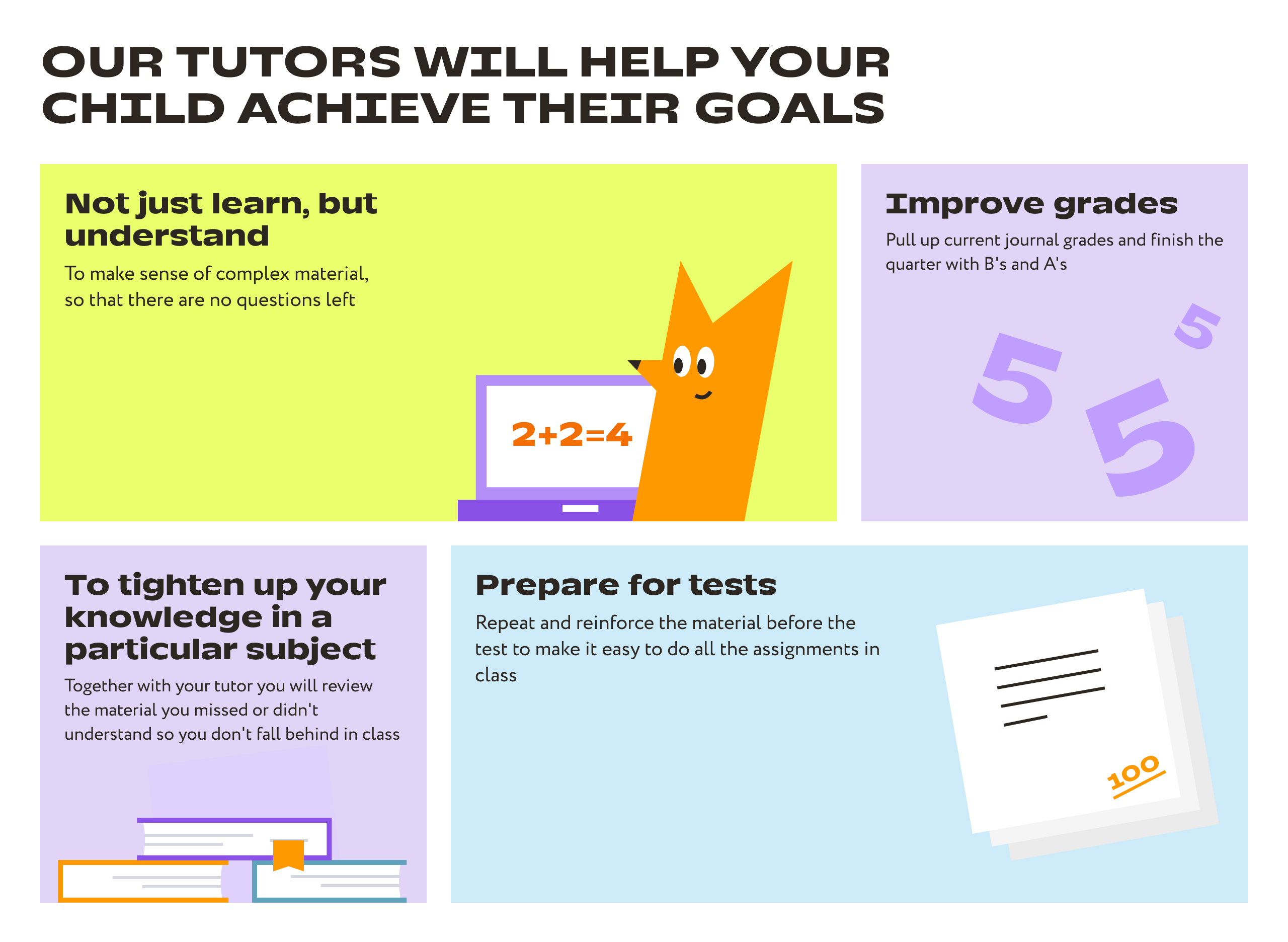
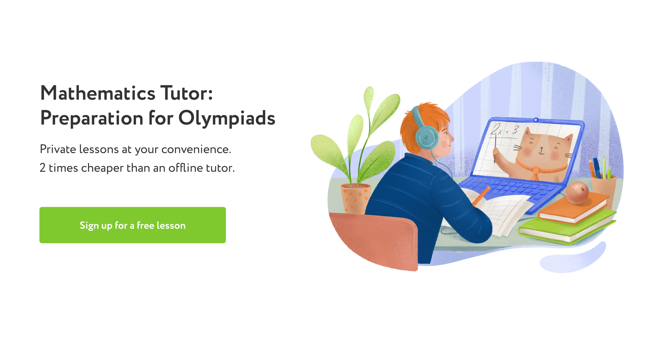
The old headline was the same for all landings too.
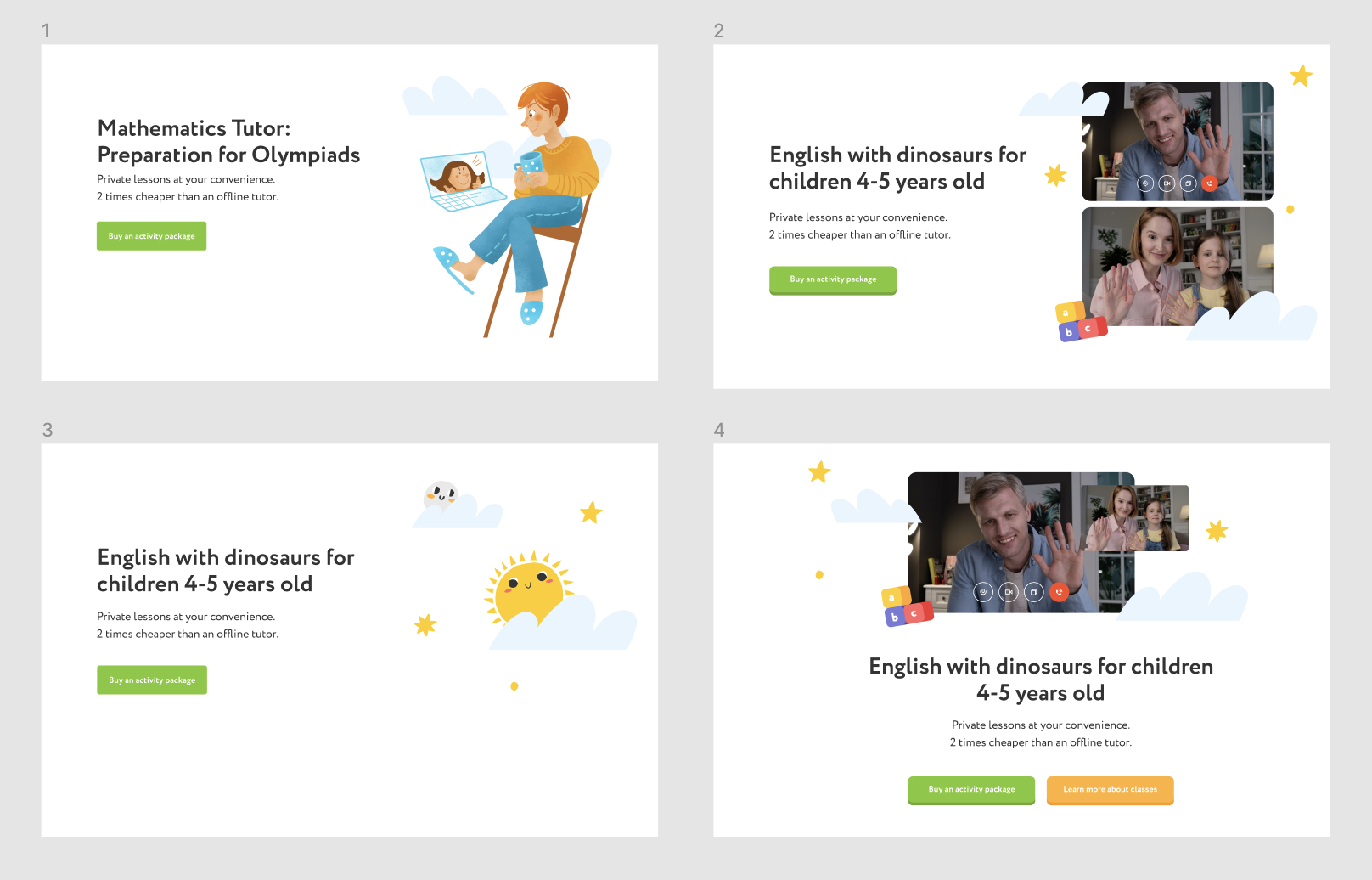
I try different variants. And finally I choose photos instead of illustrations to highlight an individual format. Аlso I decide to use photo of children of relevant age group.
I did three new heads for each segments.

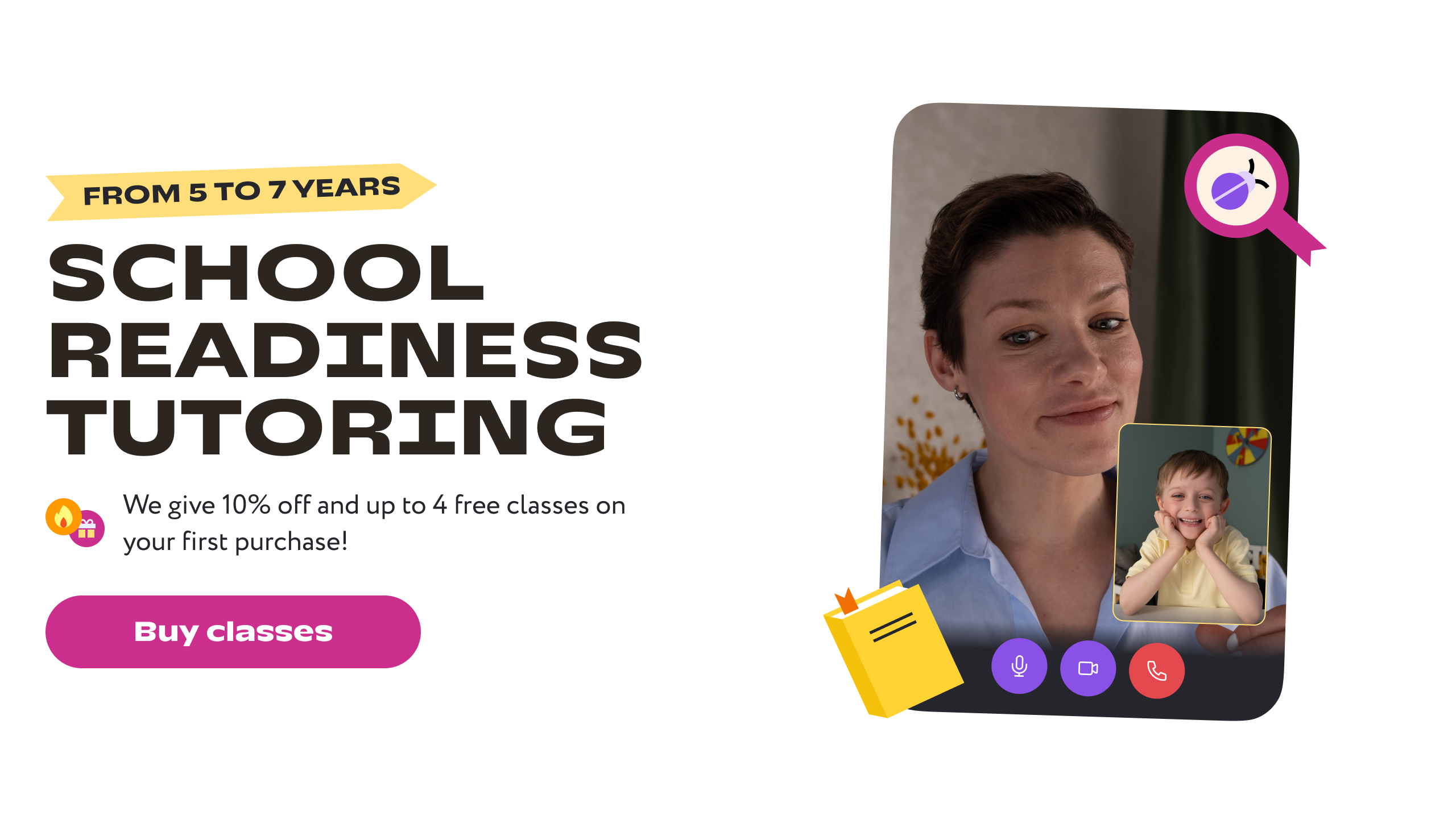
And block in new brand:


The old block has tabs. But user didn’t scroll it. But there was a lot of important information about process of learning in our school.
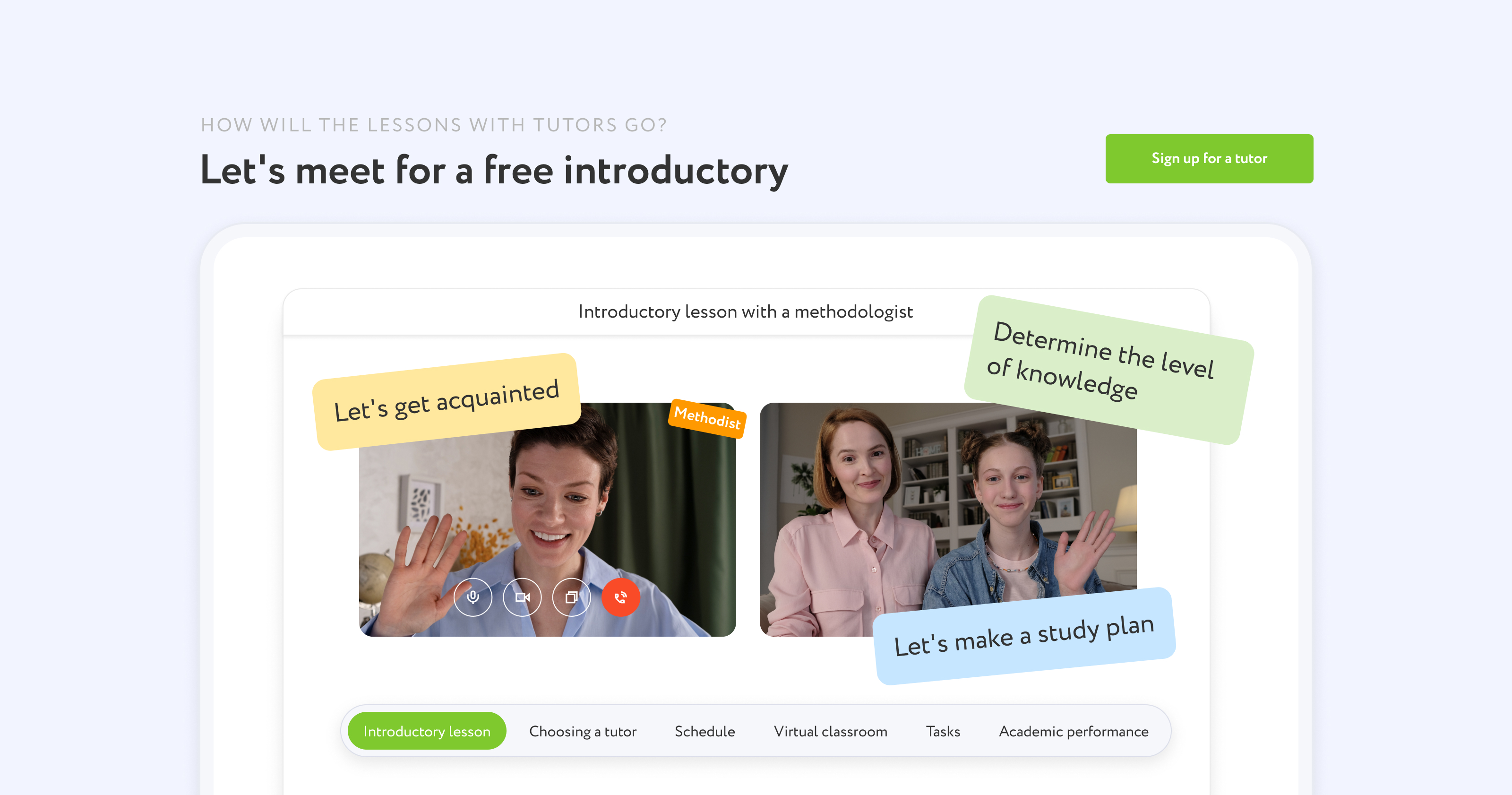
I decided to remove tabs and to show all information. And also customised this block for elementary and middle/high school. Try many variants of layout.
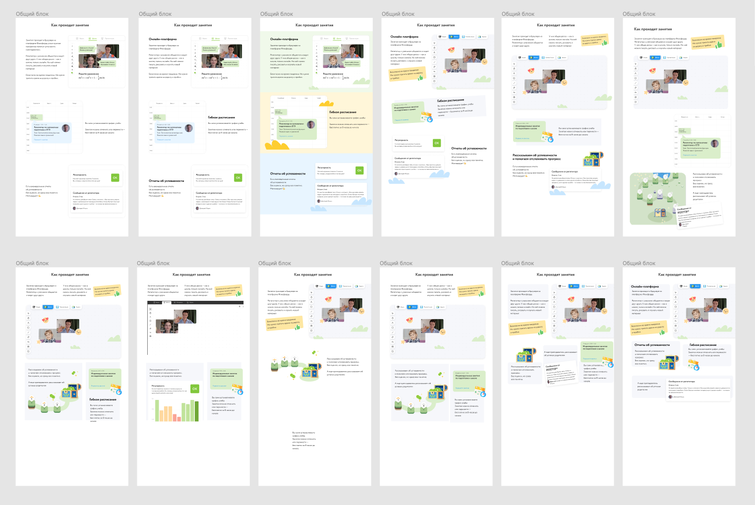
And the final in the first version:
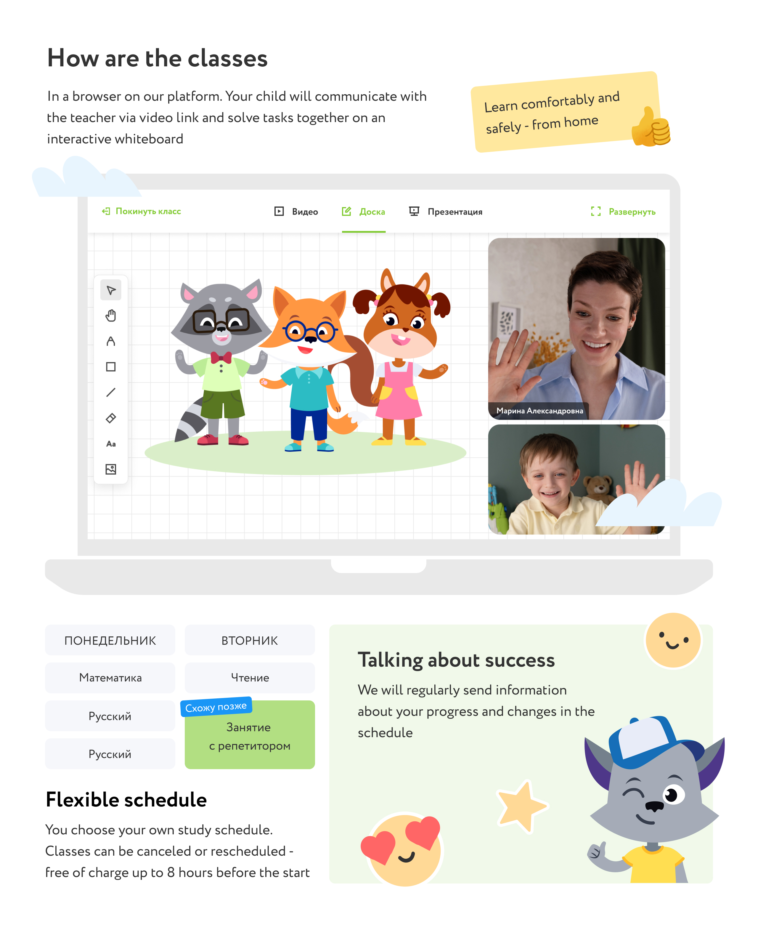
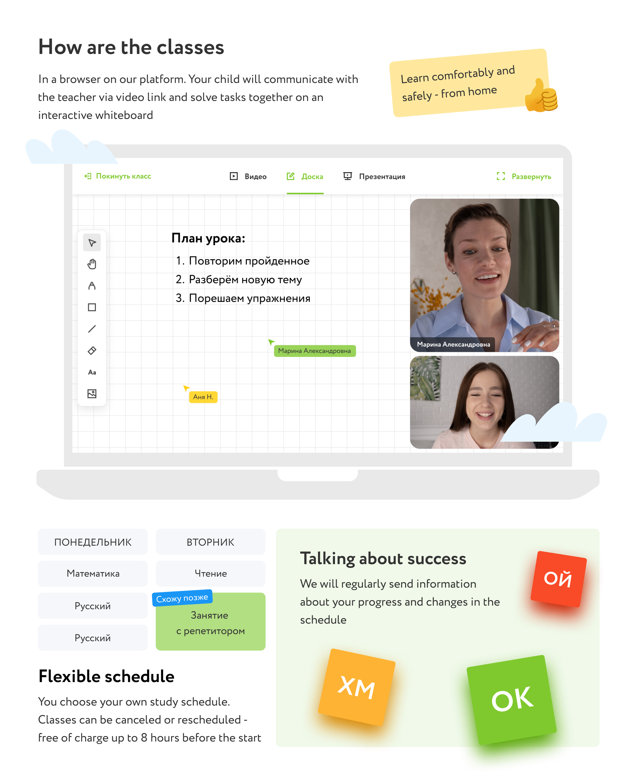
In the second version of the landing we add video instead of big block about our platorm and redesign other blocks:
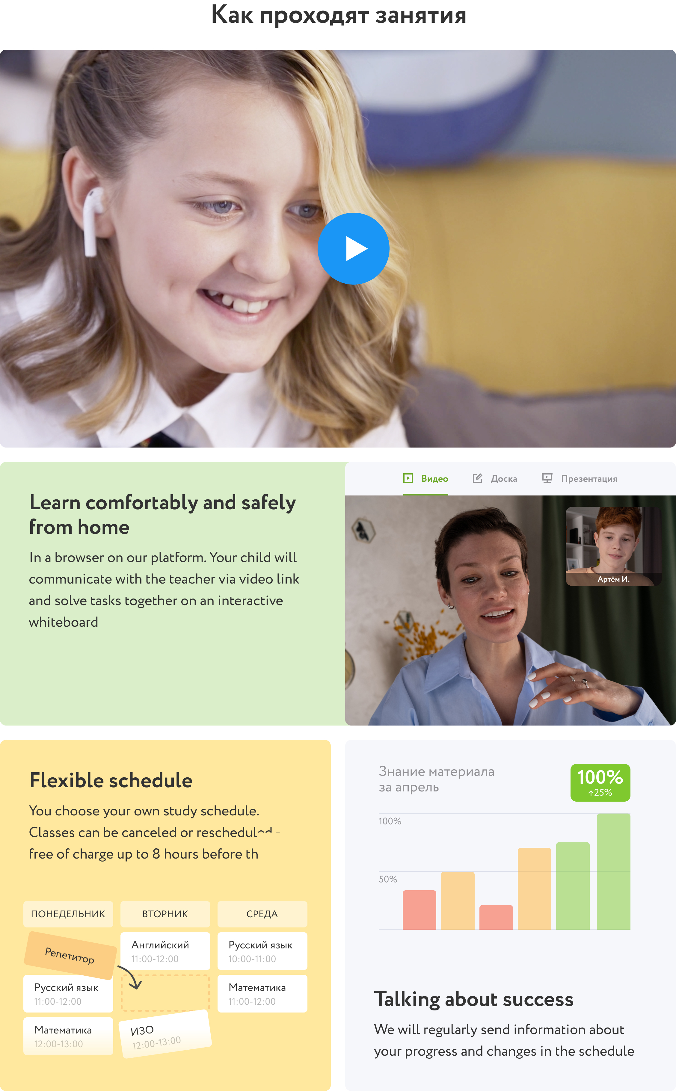
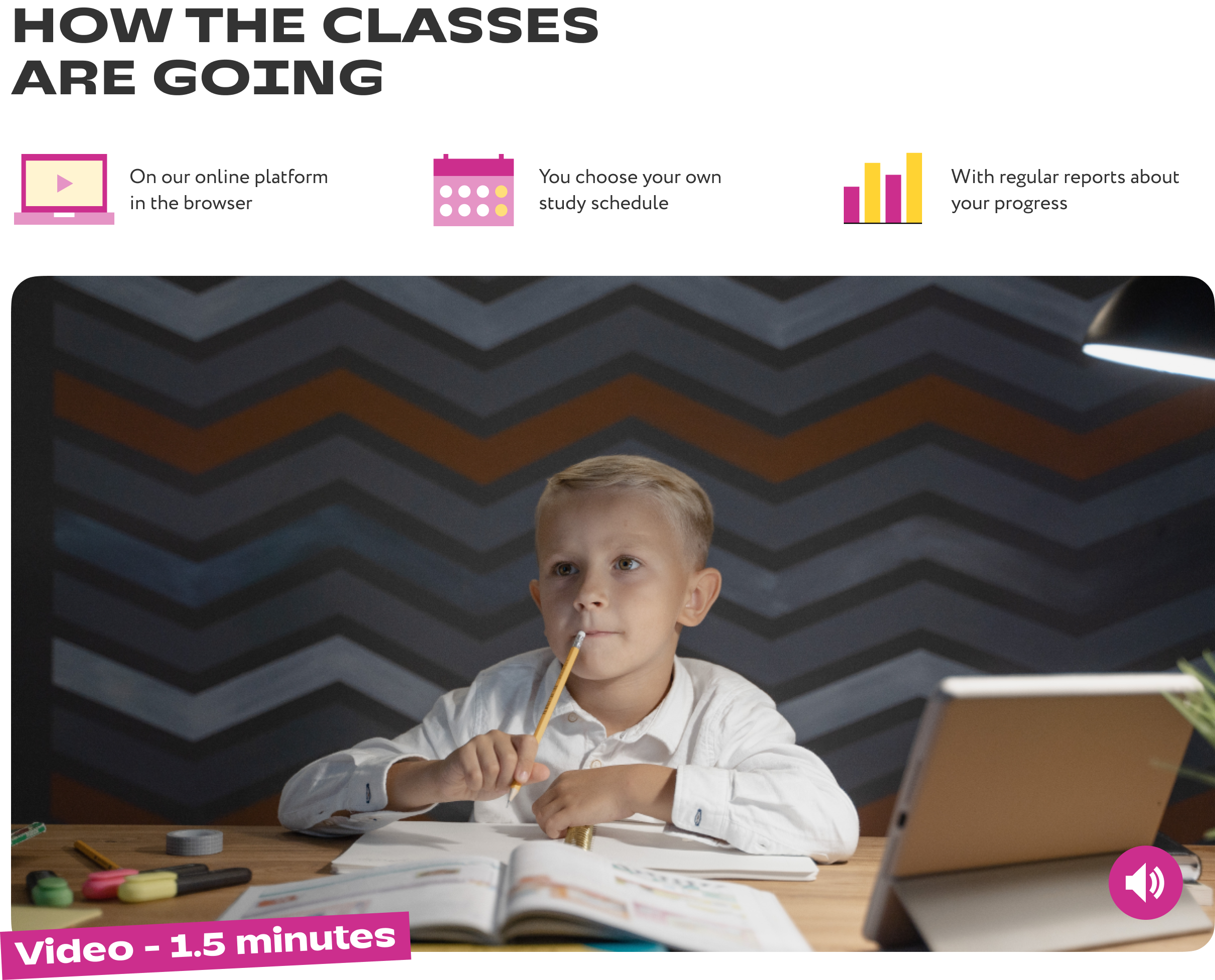
In rebranding, I shortened the block. The subtitled video plays immediately, without sound, and can be turned on. The main information about the classes was shortened and moved upstairs.
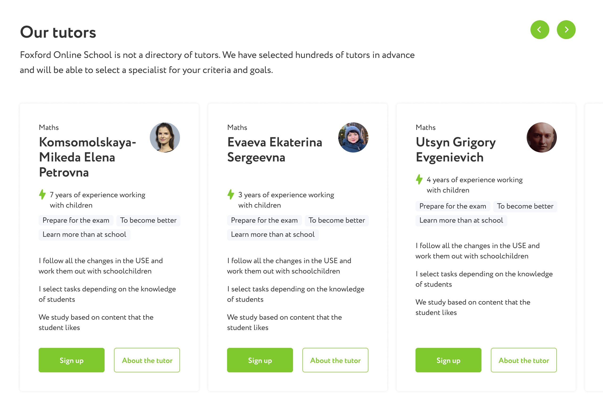
The old block had the functionality to sign up for a specific tutor. This feature didn’t work properly and needed improvement on the development side, so we decided to make a static block with a story about our tutors.
To make sure that conversion would not decrease, we did an A/B test. There was no statistical difference between variants, so we choose new block.
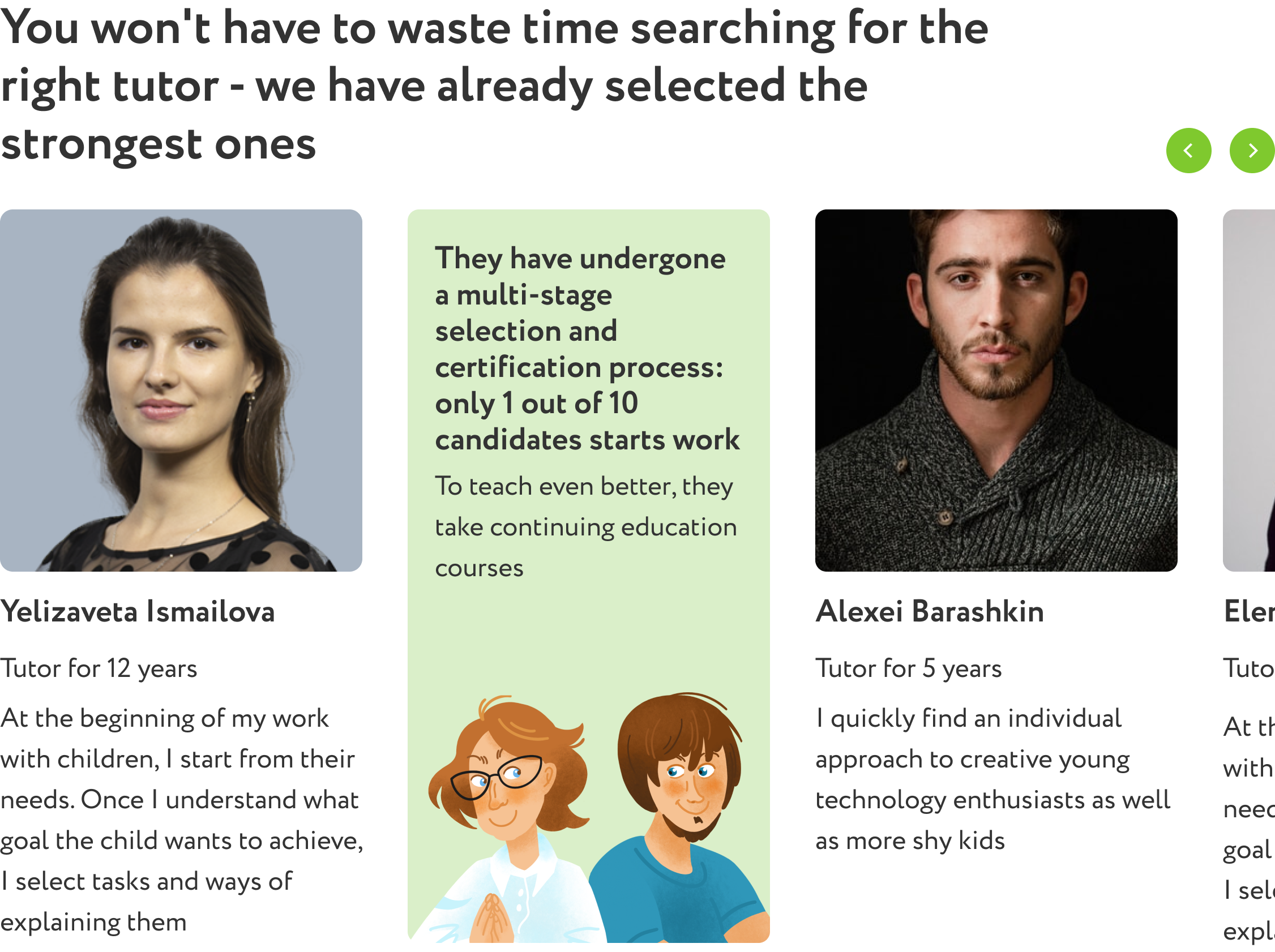
In rebranding, I put the most important communication about tutors right in the headline

In the first version We change main CTA from introductory lesson to buying a package, because introductory lesson is very expensive. We add a lot of new information about the course, so we think, that user can buy a package immediately. But if he has a doubt, he can get consultation or introductory lesson.
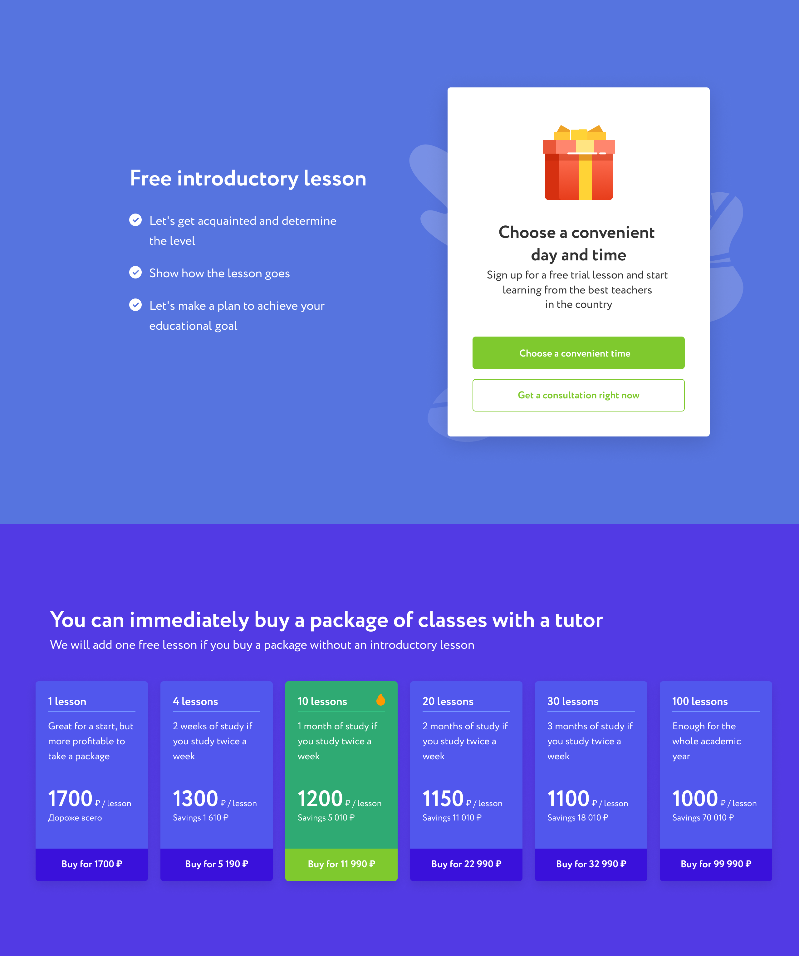
Also I add the answer to the most popular question «Can I change tutor if I don’t like it?» and add more information about introductory lesson.
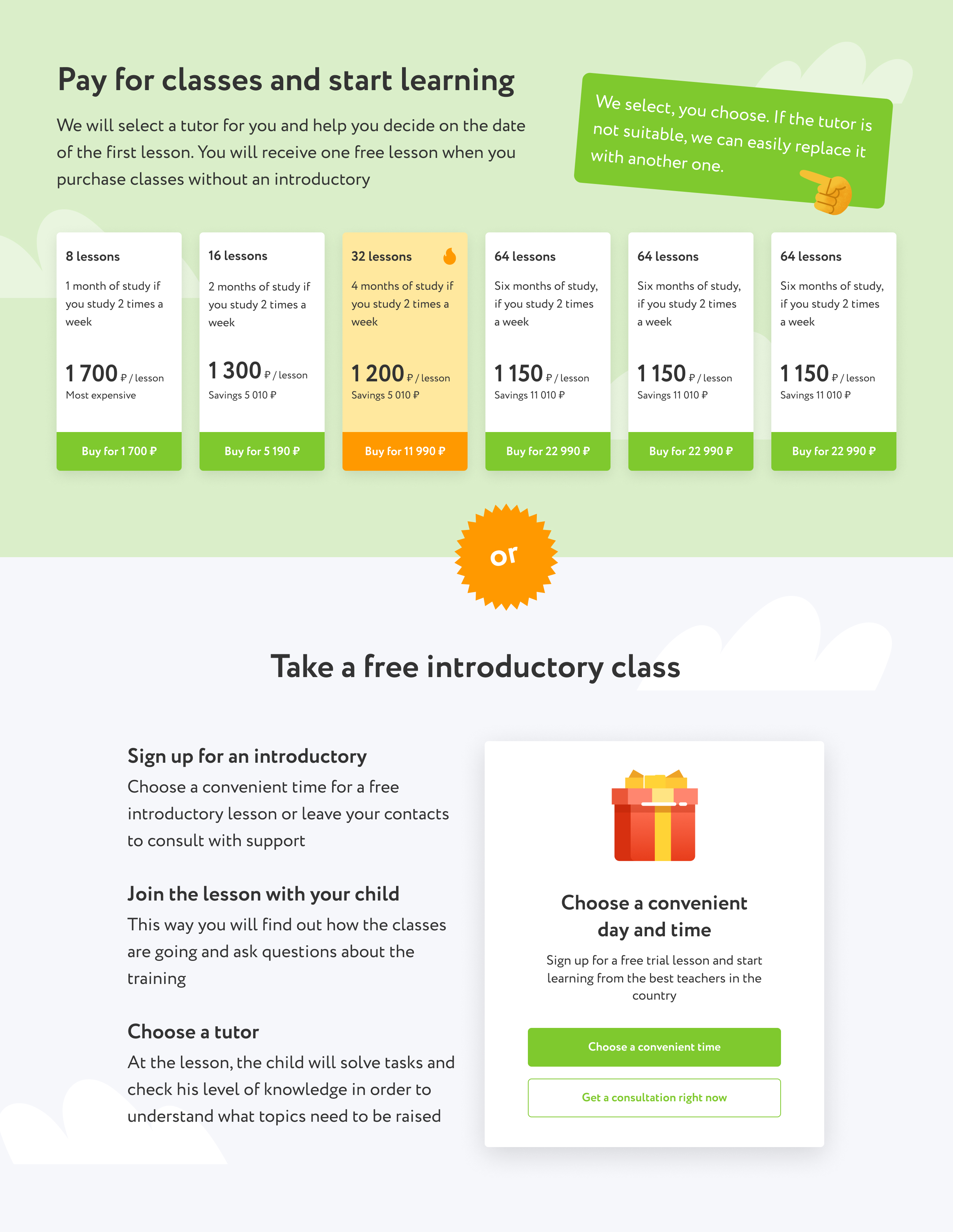
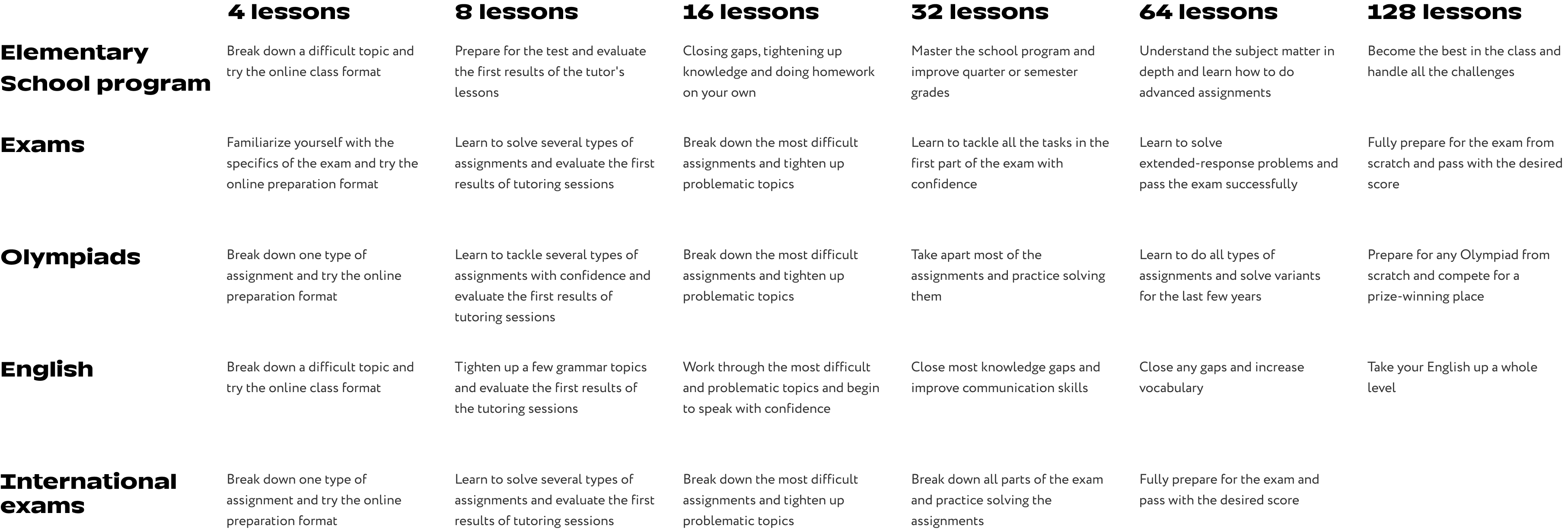
Additionally, we conducted an experiment to eliminate the introductory lesson entirely. I designed a new price block with various versions and conducted research to identify the most successful variant, which involved setting goals for each package. To achieve this, I surveyed tutors to determine the amount of progress students could make in a certain number of lessons. Using the survey data, I established specific goals for each segment, helping students choose the package that best suited their needs.
As a result of the survey, option number 3 won. This is what it looked like before the rebranding.
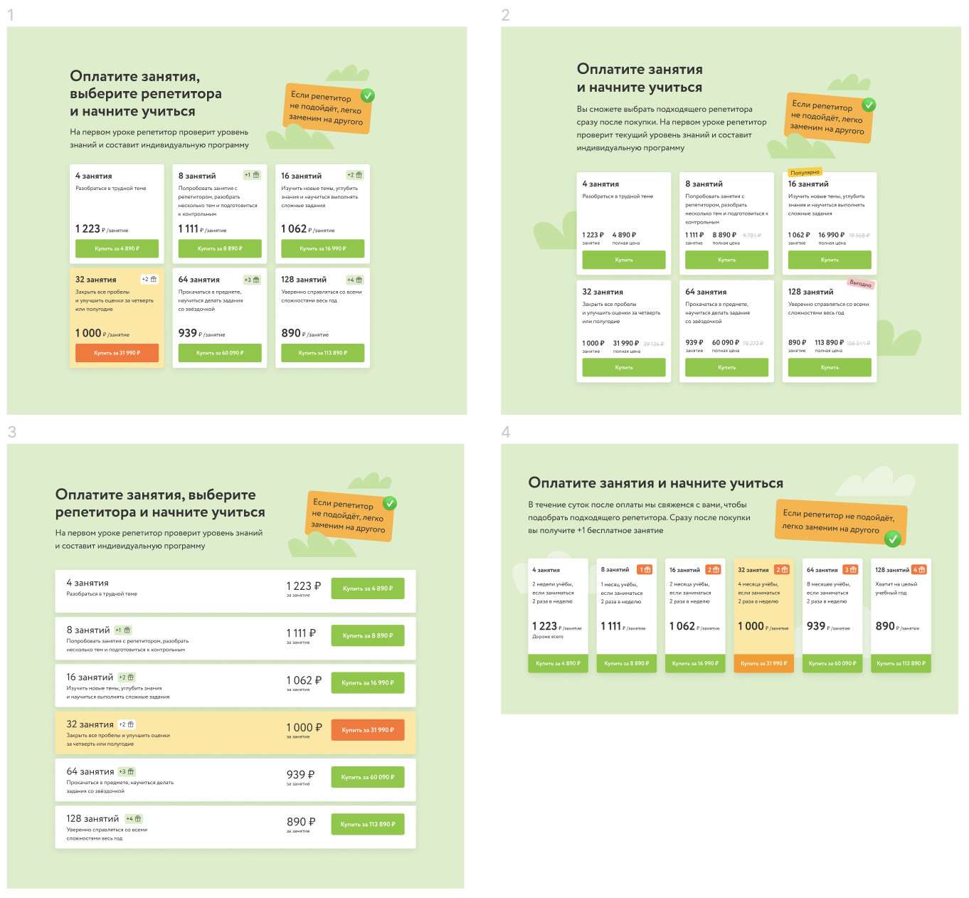
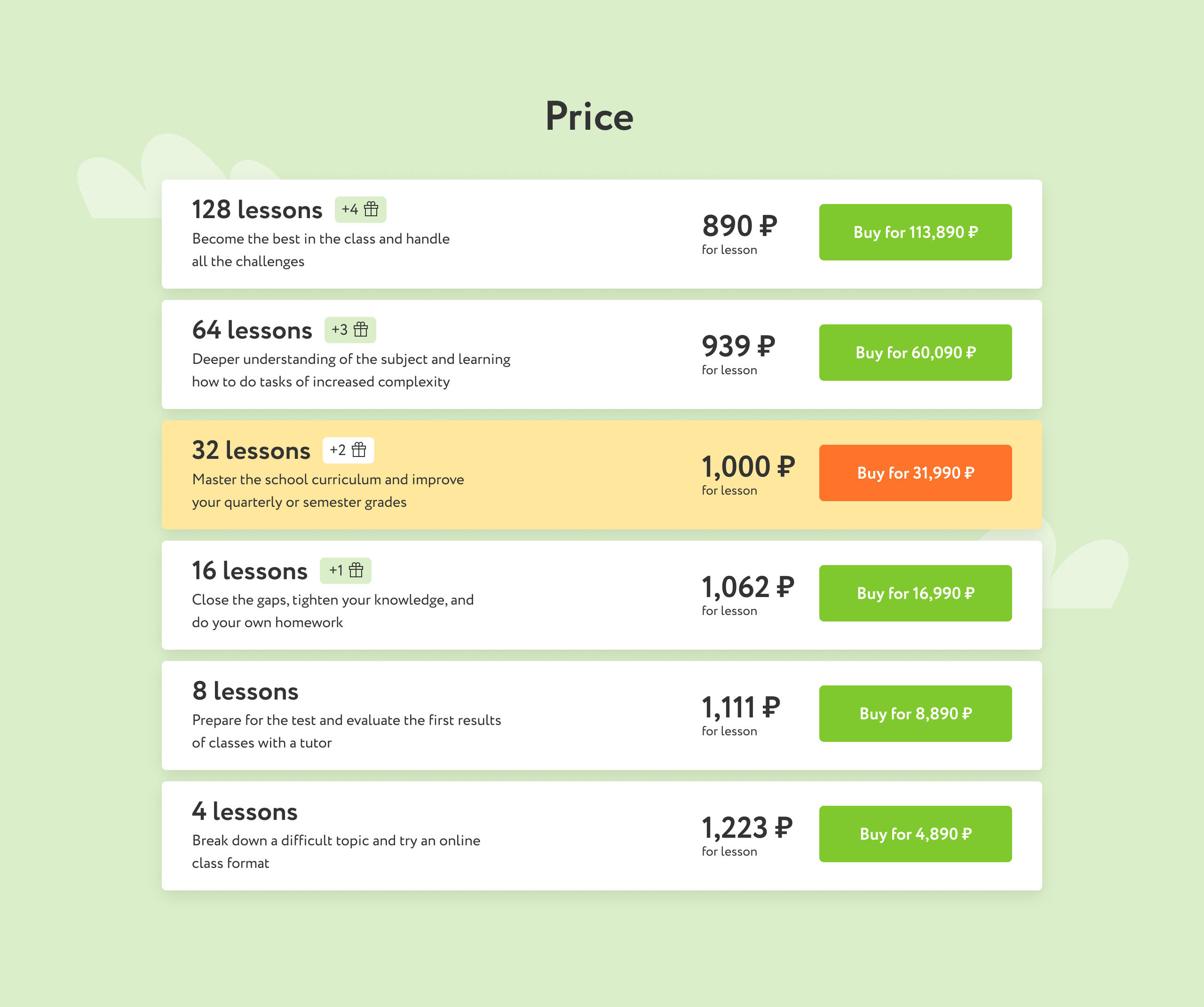
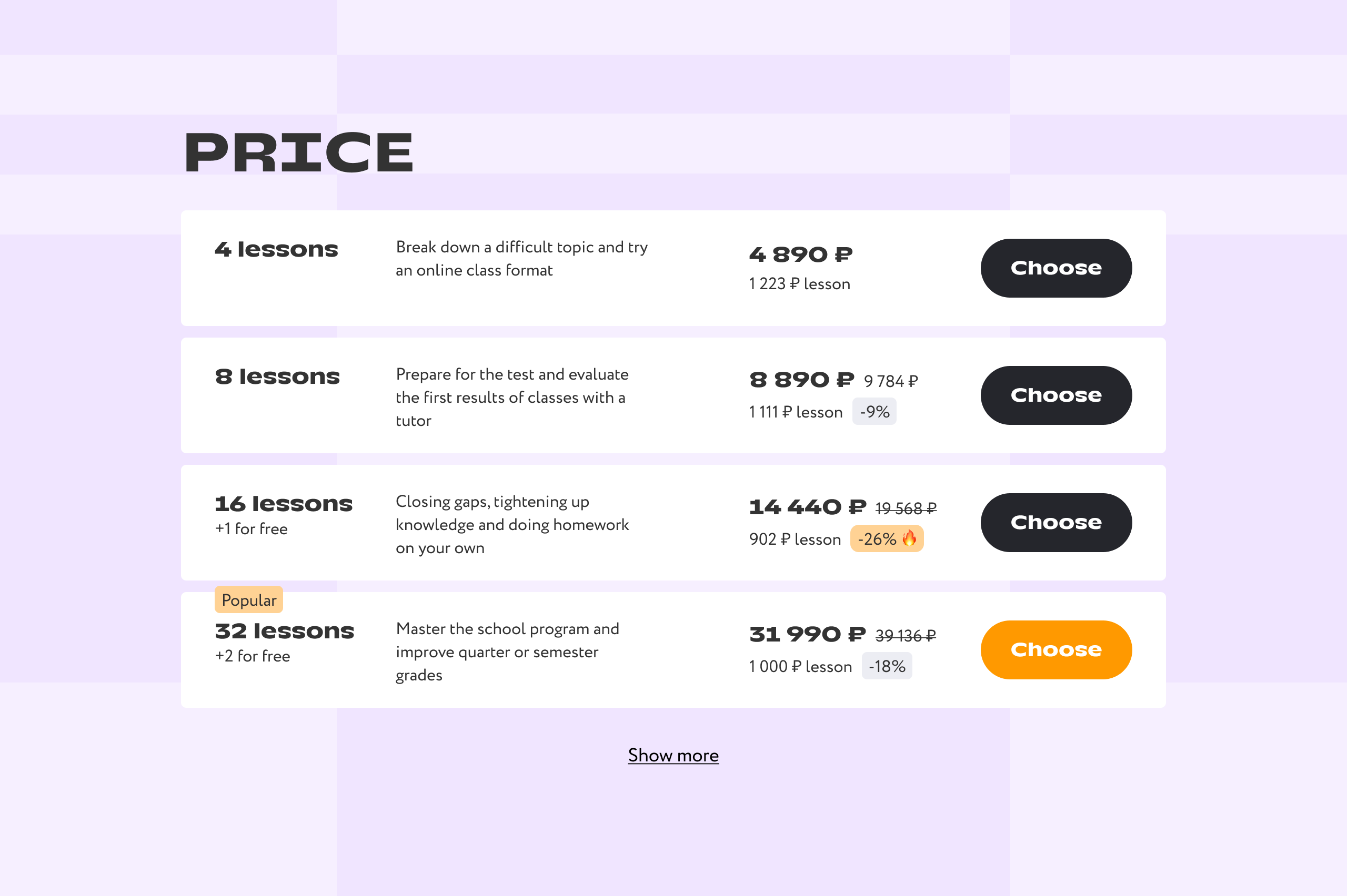
After the rebranding, I redid the pricing again. Before, we used to show the main price for one lesson, but the user has to pay the whole amount at once. Because of that we received negative feedback from support, because some customers thought that they should pay only the price per lesson. We did an AB test and started to show the whole amount, and conversions did not decrease, but the negative users disappeared.
Here's the full landings for each segment:
The first version of the redesign gave a 0.4% conversion gain and an 8% increase in profit margin.
The experiment of eliminating the introductory lesson did not reduce conversion, and gave a 12% increase in revenue due to the savings on the introductory lesson.